In this part 2 of Browser Wars, I'll be reviewing the Whatevs'. These browsers do not offer a great deal of performance improvements.
Let's take look at Skyfire. Skyfire appears to have a following despite its shortcomings. I have no idea why. Maybe it appears on the Market higher than other browsers.

The first thing you'll realise when you launch the browser is that it requires a plugin to play videos. If memory serves me right it's a feature of Skyfire to compile the videos available on a page and lets you play them just by going through the list. Apparently the feature was made into a value-added feature.

It appears that I still can play youtube on the mobile site, but it'll launch the built-in flash player. No biggie. The biggie is that I can never load the desktop version of youtube without it bouncing me back to the mobile site. I even made damn sure it's loading in desktop mode!! Annoying!!

For facebook junkies, there's a tab at the bottom that has shortcuts to sharing the page you're currently viewing. Yay!!
Other than that it pretty much performs just like the stock browser: ok on full sites, extreme choppiness on PhoneDog.com.

Oh and Skyfire doesn't have a dedicated exit button either! How neat! The worst part is that it's harder to perform the 'close tab and minimise' trick as on the stock browser because there simply is no close tab button for when there's one and only one tab open. Damn!!!

It's only when you decide to hit the back button once more to realise an exit function does exit. But it only appears after you've back-ed all the way to the default page.

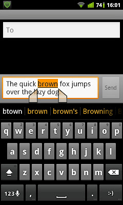
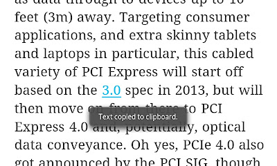
As for text selection, there's no long tap and hold feature. You'll have to go into options and tap 'select text'

Then a cursor will appear which is beyond useless at this time of touchscreen interfaces.

You tap on any place on the page and the 2 slider things will appear.
Skyfire deserves a 5/10. It offers what appears to be more features, but the lack of a close tab button for when there's only one tab ticks me off. Oh did I mention I hate the 'download the plugin now!' prompt from time to time? No performance boost keeps me away from skyfire.

The first thing you'll realise when you launch the browser is that it requires a plugin to play videos. If memory serves me right it's a feature of Skyfire to compile the videos available on a page and lets you play them just by going through the list. Apparently the feature was made into a value-added feature.

It appears that I still can play youtube on the mobile site, but it'll launch the built-in flash player. No biggie. The biggie is that I can never load the desktop version of youtube without it bouncing me back to the mobile site. I even made damn sure it's loading in desktop mode!! Annoying!!

For facebook junkies, there's a tab at the bottom that has shortcuts to sharing the page you're currently viewing. Yay!!
Other than that it pretty much performs just like the stock browser: ok on full sites, extreme choppiness on PhoneDog.com.

Oh and Skyfire doesn't have a dedicated exit button either! How neat! The worst part is that it's harder to perform the 'close tab and minimise' trick as on the stock browser because there simply is no close tab button for when there's one and only one tab open. Damn!!!

It's only when you decide to hit the back button once more to realise an exit function does exit. But it only appears after you've back-ed all the way to the default page.

As for text selection, there's no long tap and hold feature. You'll have to go into options and tap 'select text'

Then a cursor will appear which is beyond useless at this time of touchscreen interfaces.

You tap on any place on the page and the 2 slider things will appear.
Skyfire deserves a 5/10. It offers what appears to be more features, but the lack of a close tab button for when there's only one tab ticks me off. Oh did I mention I hate the 'download the plugin now!' prompt from time to time? No performance boost keeps me away from skyfire.
Next we have Maxthon Browser.
Upon launching, you will be greeted with 3 pages. Starting with the left most, you see suggested shortcut sites. Swipe to the right you'll see bookmarks. Lastly at the rightmost you see your browsing history.
One thing I noticed about Maxthon browser is that it has this Safari-esque thing that clears the URL field when you tap on the cross. Very handy when you do not want to 'select all -> backspace' to clear the URL.
The annoying thing with Maxthon is that it requires gestures to fully use the browser. Opening new tabs is not possible without gestures. So is moving between tabs. Not something I like doing. Lazy to test how it performs when opening 2 webpages.
Personally don't see myself using this browser as I prefer my browser to be less gimmicky.
On the surface it has some resemblance to the Chrome browser, specifically the tabs area.
Thing I don't like with it is the label-less icons. Personal thing.
Tabs management.
Exit button.
Again, the browsers in this post do not offer much performance enhancements. So as expected, scrolling and pinch zooming on phonedog.com is choppy at best. Opening Engadget and PhoneDog in separate tabs is doable but will present lagginess.
Last but not least we have Miren Browser. Miren Browser is said to be the browser in the famous MIUI custom ROM.
There's nothing much to Miren Browser. Its performance is on par with the stock browser. It has a clean look though.
Text selection is a bit ambiguous. You'd have to find the 'Select Text' option in the pop-up menu. Then the who raindrop things appear. Thing with it is that the selection is not highlighted, so it's quite difficult to determine what have you selected.
It also has a dedicated exit button.
In Part 3, I'll be talking about the Awesome. They are the ones that offer performance enhancement to varying degrees, but generally perform better than the Whatevs.
Please tell me what you think! See you next time!


